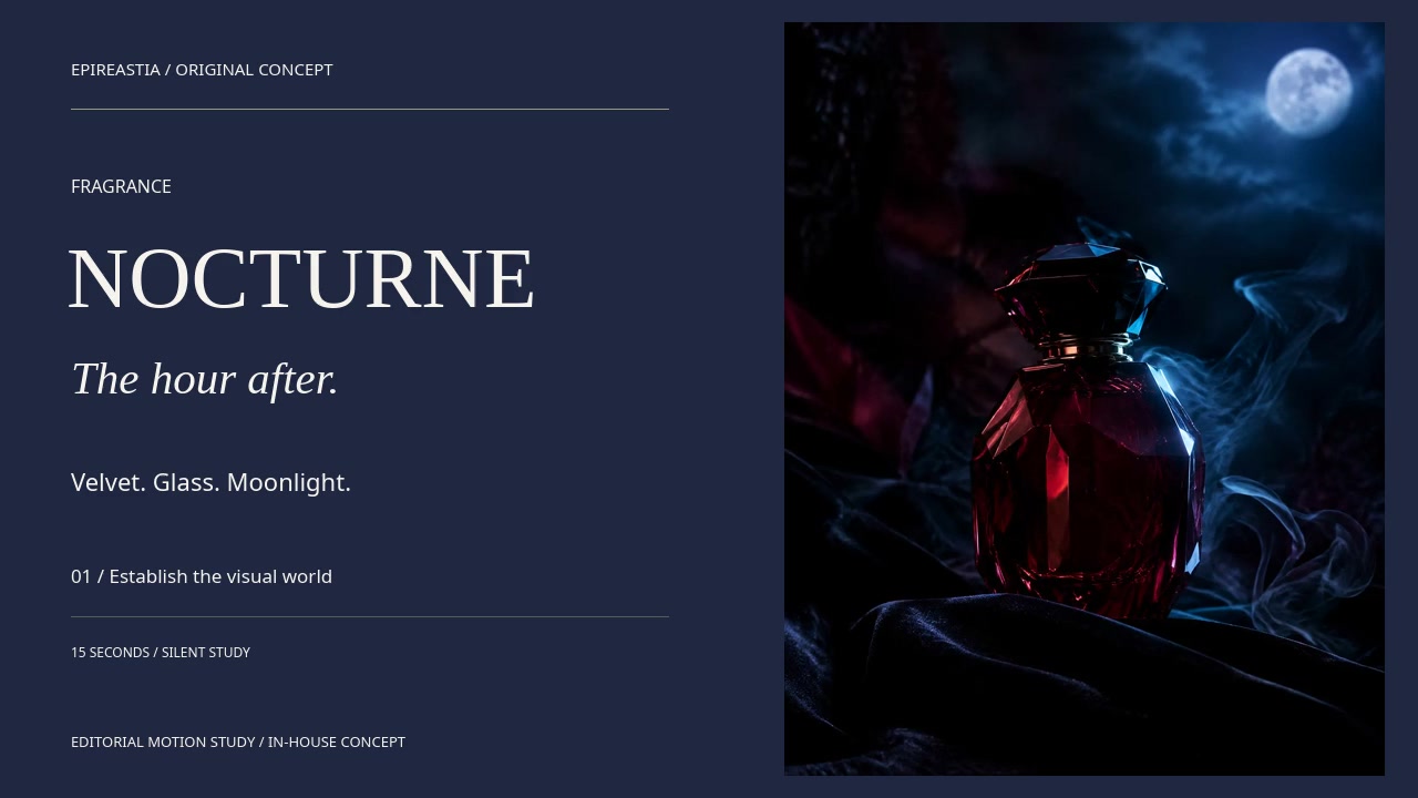
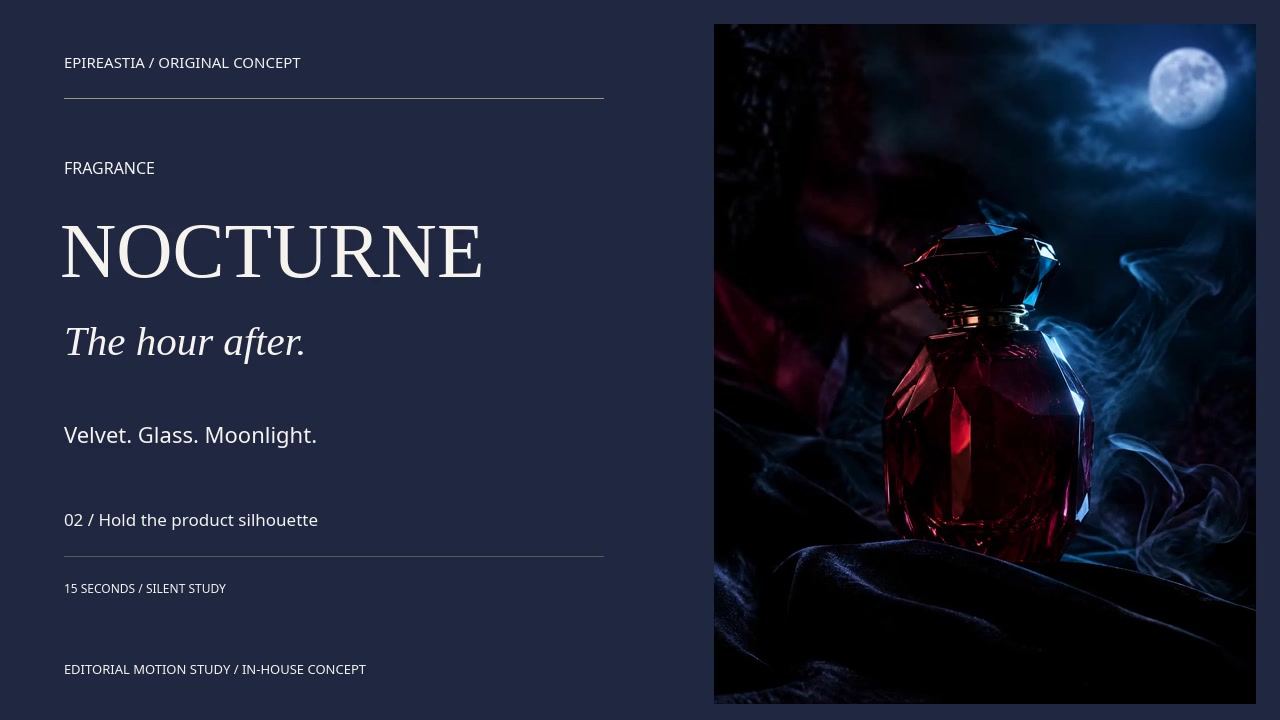
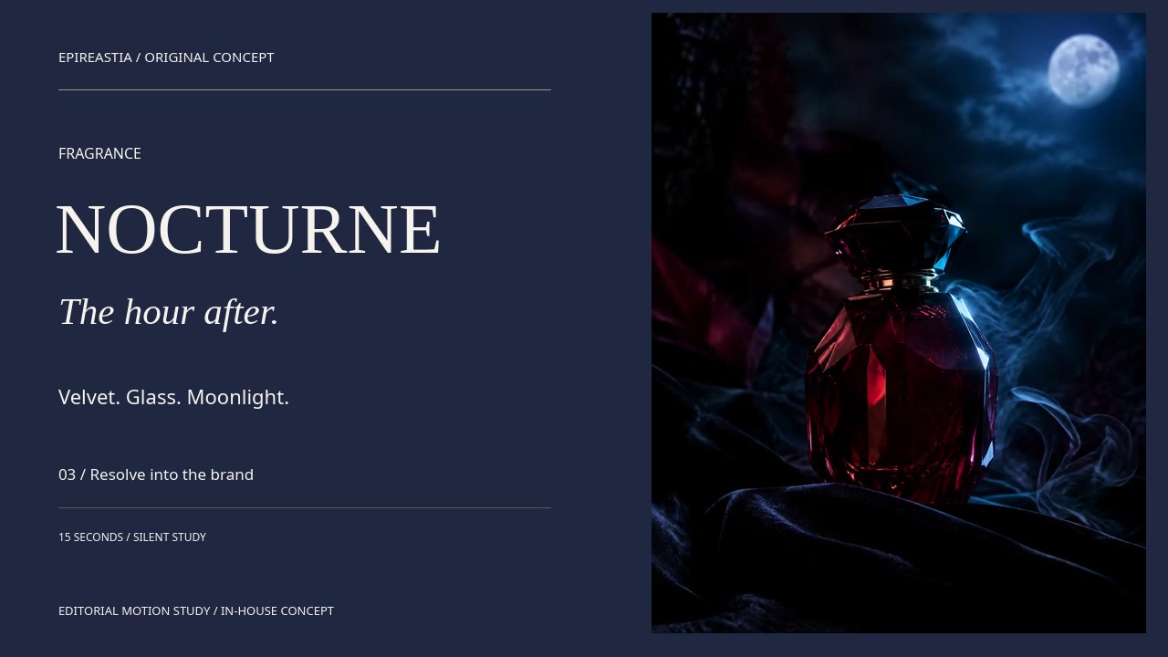
An original fragrance concept developed as an intimate midnight campaign system.
Art direction / Campaign / DigitalIndependent studio study
01 / The concept
An object. A point of view.
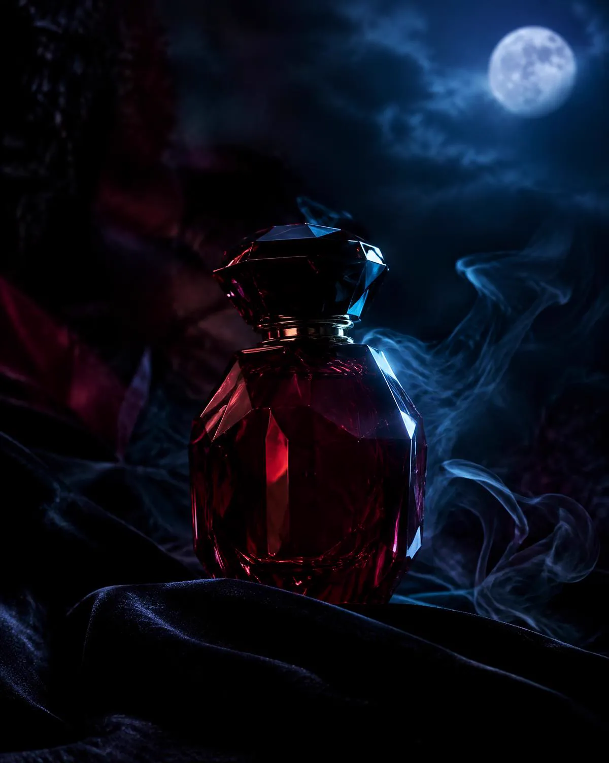
Night without the usual black-and-gold shorthand. Moonlight on velvet, smoke as a typographic line and one precise cool rim light.
The commercial intention
Introduce a fictional niche fragrance as an intimate, memorable midnight ritual, not another generic dark luxury bottle.
The intended audience
Design-conscious fragrance enthusiasts who value atmosphere, restraint, distinctive objects and storytelling.
The visual thesis
The quiet hour after the crowd leaves. A single faceted bottle, velvet darkness, a cool rim light and ribbons of smoke become one recognizable visual signature.
02 / Art direction
Make the mood specific.
Colour, material and light form a consistent visual vocabulary before the work moves into different placements.
The fixed visual source
Midnight
Moonlit lilac
Paper light
Material references
Faceted glass, deep velvet and a restrained smoke ribbon.
Lighting
One cool grazing rim defines the bottle while soft reflections keep the dark scene readable.
Type direction
High-contrast serif naming with quiet italic narrative and small editorial labels.
01
Wine and midnight-blue palette, without gold
02
Smoke treated as a typographic line
03
A single cool rim light to define the flask
03 / Campaign rollout
One visual idea. Three formats.
The same source object travels into a wide campaign hero, a vertical feed composition and a square product tile. Image framing and editorial copy change together.
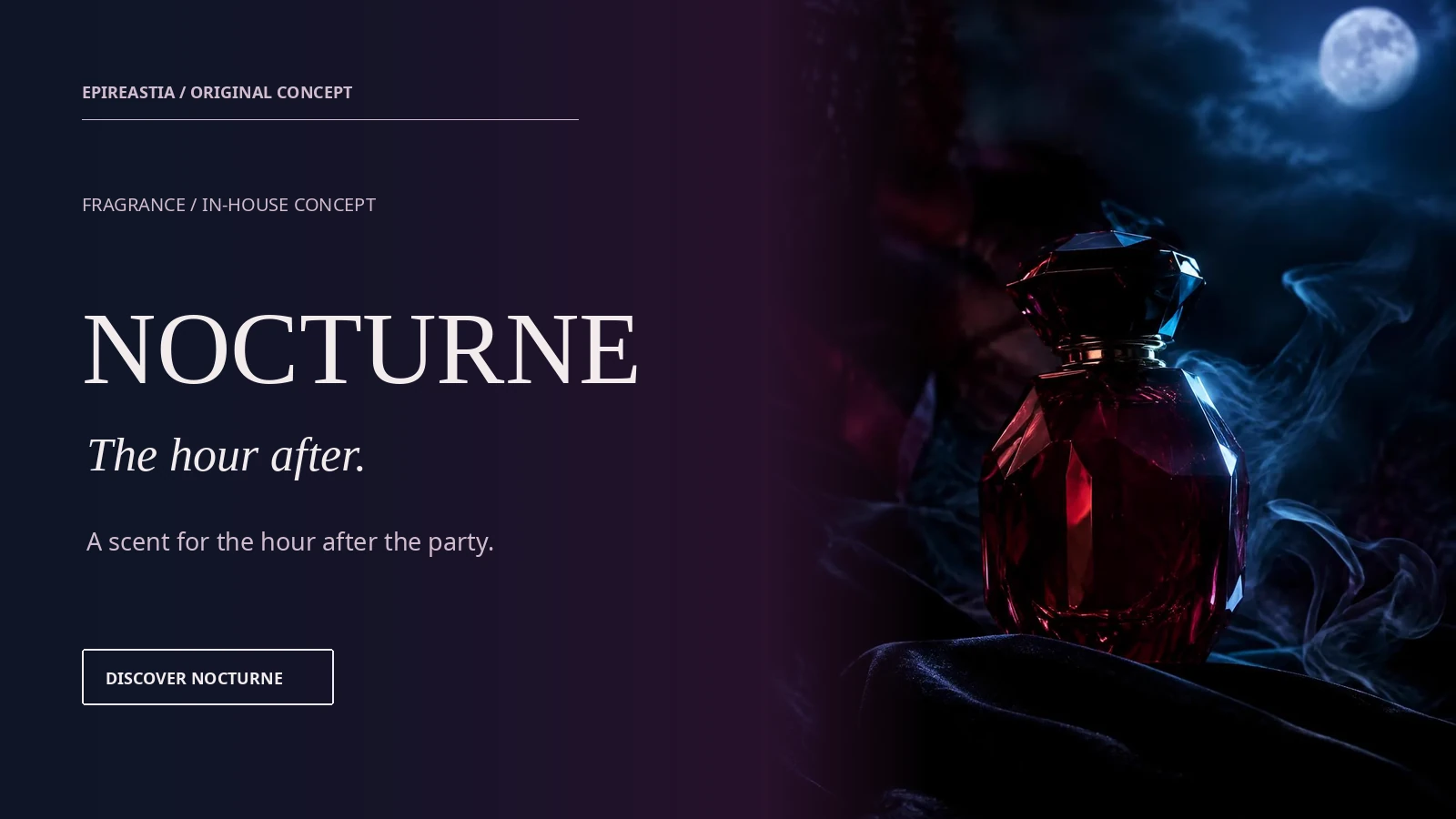
01 / 16:9Desktop web / 1600 x 900
Launch landing hero
First impression with a stable product silhouette and clear space for copy.
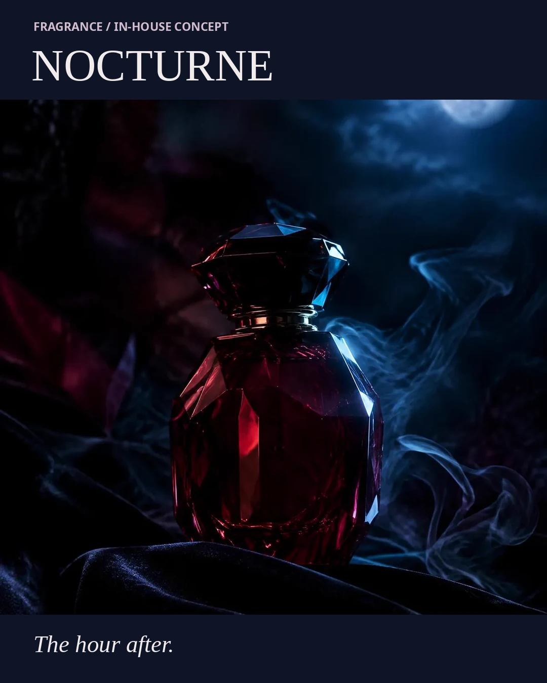
02 / 4:5Social feed / 1080 x 1350
Social launch creative
Fragrance narrative visible at mobile scroll speed without altering the bottle.
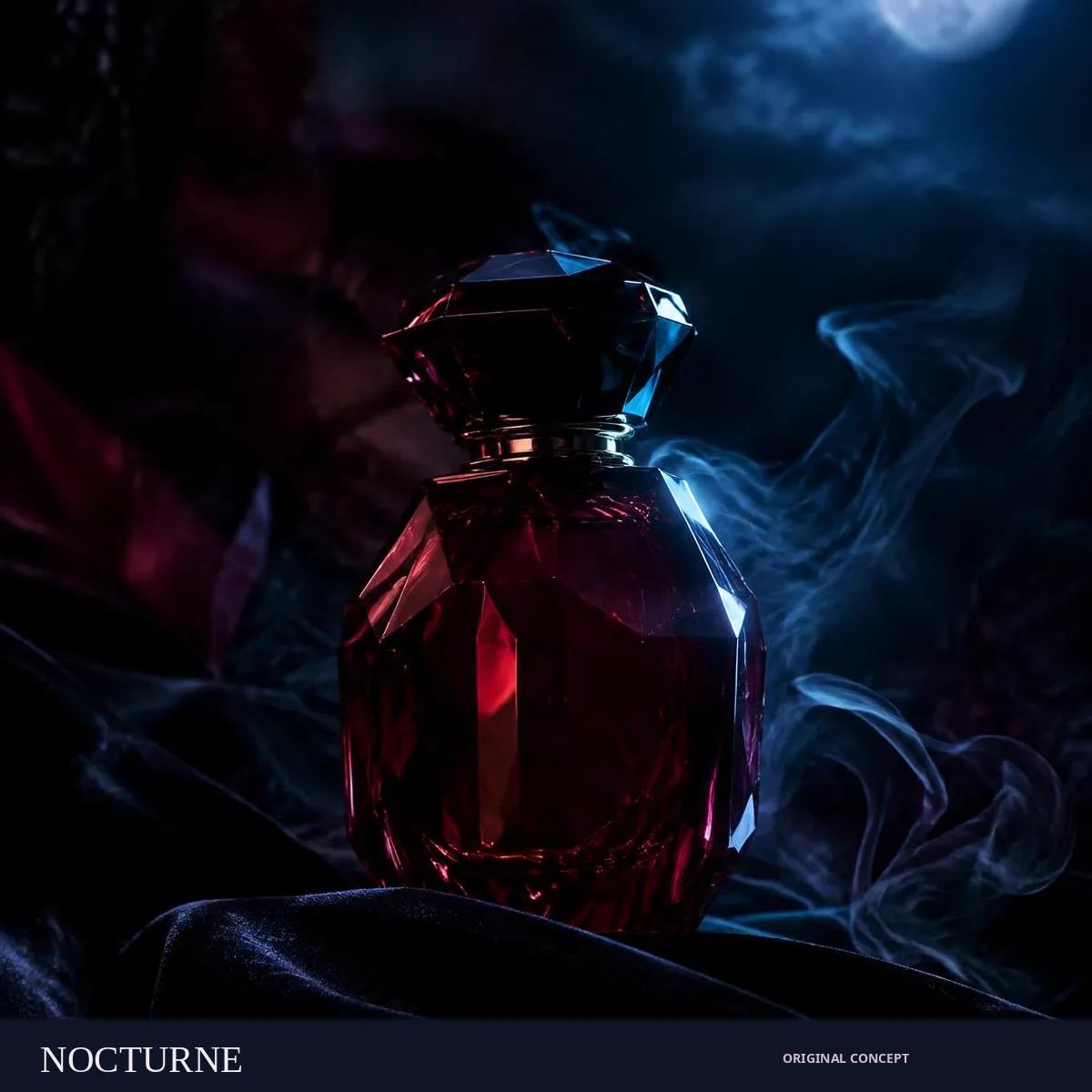
03 / 1:1Catalog and product tile / 1200 x 1200
Product detail visual
Consistent bottle identity and legible brand recognition at smaller sizes.
04 / Motion & film direction
Give the idea a little time.
Watch the editorial rhythm, then explore the proposed physical film beats. The moving study and the production intention are identified separately.
15 seconds / Editorial motion study
The hour after / a fragrance teaser in moonlight, velvet and smoke.
Make the bottle recognizable before revealing the name; use restraint rather than spectacle to communicate the private midnight ritual.
A playable edit of source stills, typography and camera-like reframing. The physical lighting, water, smoke or object actions described below are proposed film direction.
Midnight restraint, a cool rim light and the private ritual of fragrance.
Design demonstration. No retail offer, price or checkout.
A closer look
The object, in context.
The same source artwork carries from the campaign into this product presentation.
Explore the collection and inspect the image views.
Desktop A complete product view and a separate decision panel share the frame.
Mobile The image leads. Copy and the action move below it, preserving the subject.
Handoff Type, colour and image layers stay editable; the crop is evaluated inside the layout.
06 / Process & production
A clear source. A deliberate system.
Original AI-assisted hero photography is the single product reference. All three channel placements reuse the same bottle pixels with deterministic crop and graphic composition, not newly hallucinated packaging.
01 / Establish
A visual authority.
Begin with the original in-house AI-assisted product visual. Record the object, silhouette, material appearance and intended placement.
02 / Compose
A channel language.
Build each layout around the same image source. Keep typography and commerce copy separate in the live interface; inspect crops at their intended size.
03 / Review
A usable handoff.
Check object geometry, material, type hierarchy and responsive behaviour. Treat the motion edit as previsualisation for a future filmed or generated production.
Original in-house speculative concept campaign. Not a paid brand commission, retail product or real launch. Visual development and implementation were AI-assisted. No client approval, campaign performance or sales outcome is represented.
07 / Quality & system thinking
Keep what makes it itself.
Acceptance criteria for the concept system. Reusing a source protects visual continuity; it does not establish manufacturing feasibility or real-world performance.
01
Bottle and cap geometry match in all three placements
02
No phantom typography printed on the bottle
03
Dark backgrounds retain detail at mobile brightness
04
Headline and concept CTA clear at desktop and mobile sizes
Included in this case study
16:9 campaign hero · 4:5 social creative · 1:1 product tile · Responsive commerce concept · 15-second editorial motion study