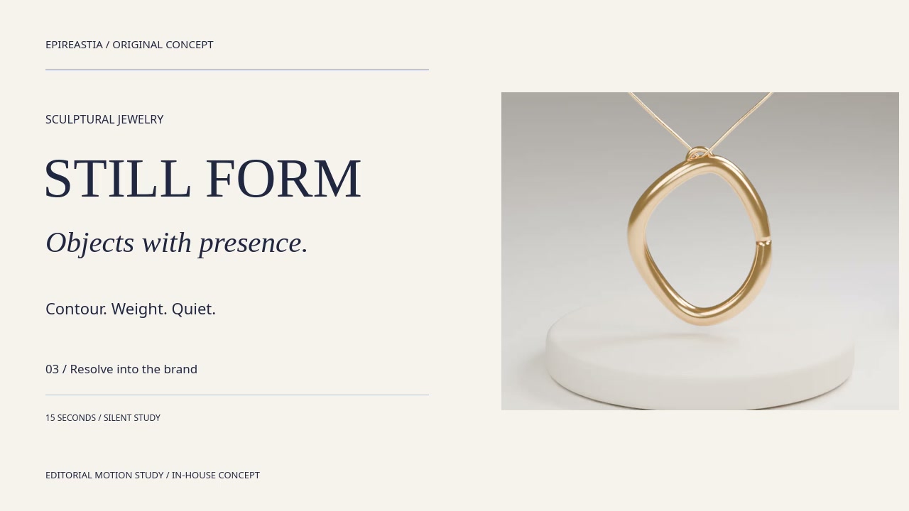
An original gold-tone jewelry concept shaped into a coherent collection and commerce presentation.
Art direction / Campaign / DigitalIndependent studio study
01 / The concept
An object. A point of view.
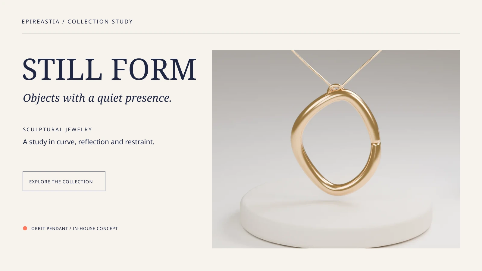
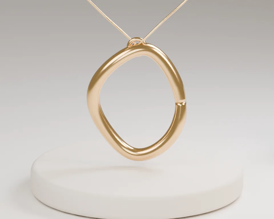
Give a simple curve room to hold attention. Warm stone, a soft reflective finish and generous negative space turn the Orbit Pendant into the collection's anchor.
The commercial intention
Present an imagined three-piece jewelry collection with a recognizable lead object, consistent editorial placements and a clear product-browsing hierarchy.
The intended audience
Design-conscious jewelry shoppers and independent boutique buyers drawn to restrained silhouettes, sculptural objects and calm presentation.
The visual thesis
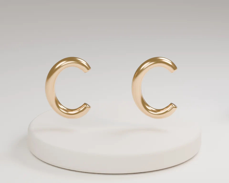
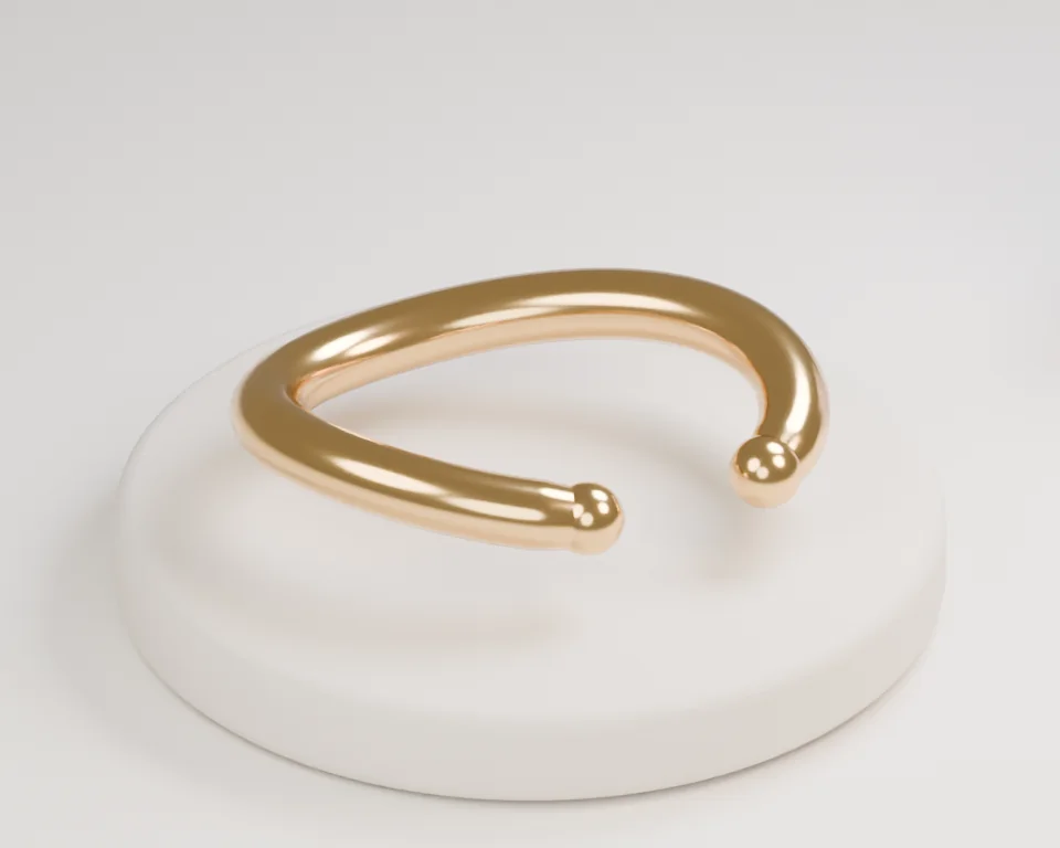
A collection of considered curves. The Orbit Pendant anchors the campaign while Arc Studs and Form Cuff extend its quiet visual rhythm.
02 / Art direction
Make the mood specific.
Colour, material and light form a consistent visual vocabulary before the work moves into different placements.
The fixed visual source
Warm paper
Ink detail
Small persimmon accent
Material references
Gold-tone reflective objects, pale stone podiums and soft neutral textiles.
Lighting
Broad soft studio light with narrow natural highlights to describe each curve; no exaggerated metallic glow.
Type direction
Quiet serif naming, expressive italic captions and concise product labels with generous margins.
Arc Studs
A separate paired curved-earring concept in the same visual collection.
Form Cuff
A separate open-cuff concept with softened ends and a matching gold-tone appearance.
01
Orbit Pendant leads; Arc Studs and Form Cuff remain distinct supporting objects
02
Soft stone and paper tones let the gold-tone finish carry the light
03
Clear product naming and restrained layouts keep the collection easy to browse
03 / Campaign rollout
One visual idea. Three formats.
The same source object travels into a wide campaign hero, a vertical feed composition and a square product tile. Image framing and editorial copy change together.
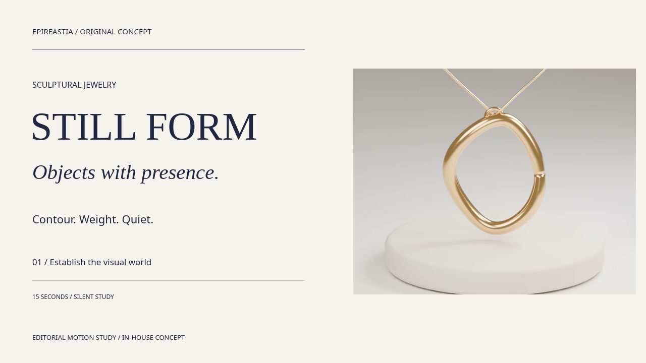
01 / 16:9Desktop web / 1600 x 900
Collection landing hero
A complete pendant silhouette with space for the collection premise and one clear action.
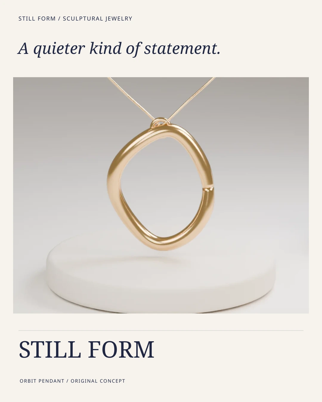
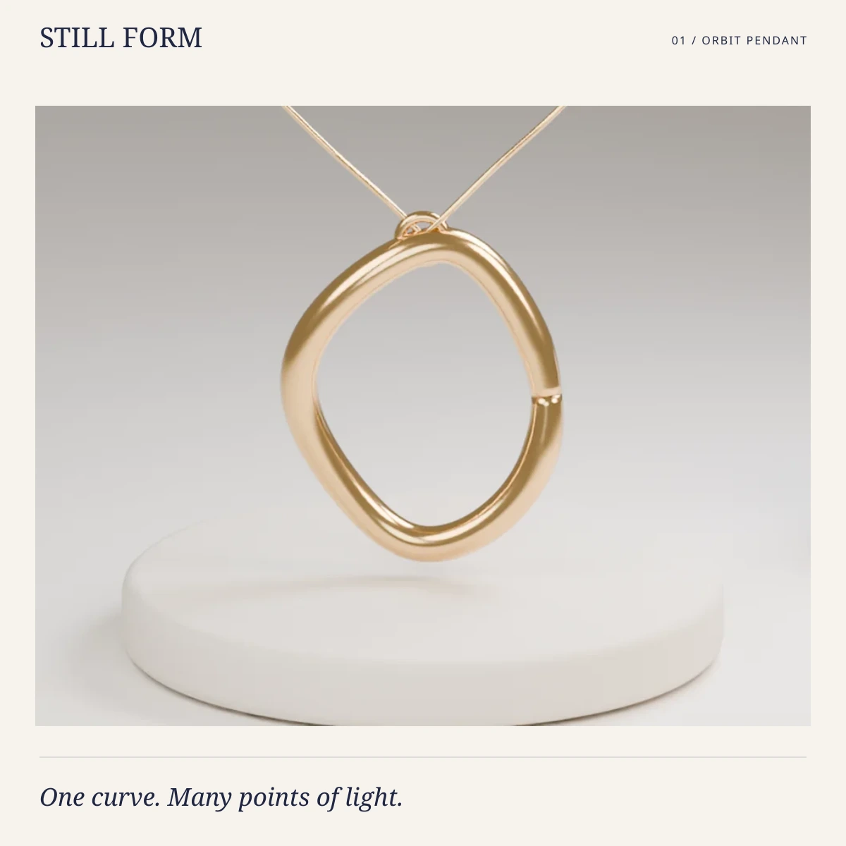
02 / 4:5Social feed / 1080 x 1350
Social collection creative
A mobile-first composition that holds the same pendant image between a clear headline and product label.
03 / 1:1Catalog and product tile / 1200 x 1200
Orbit Pendant product tile
A calm product-led tile with the same recognizable open-orbit geometry and concise naming.
04 / Motion & film direction
Give the idea a little time.
Watch the editorial rhythm, then explore the proposed physical film beats. The moving study and the production intention are identified separately.
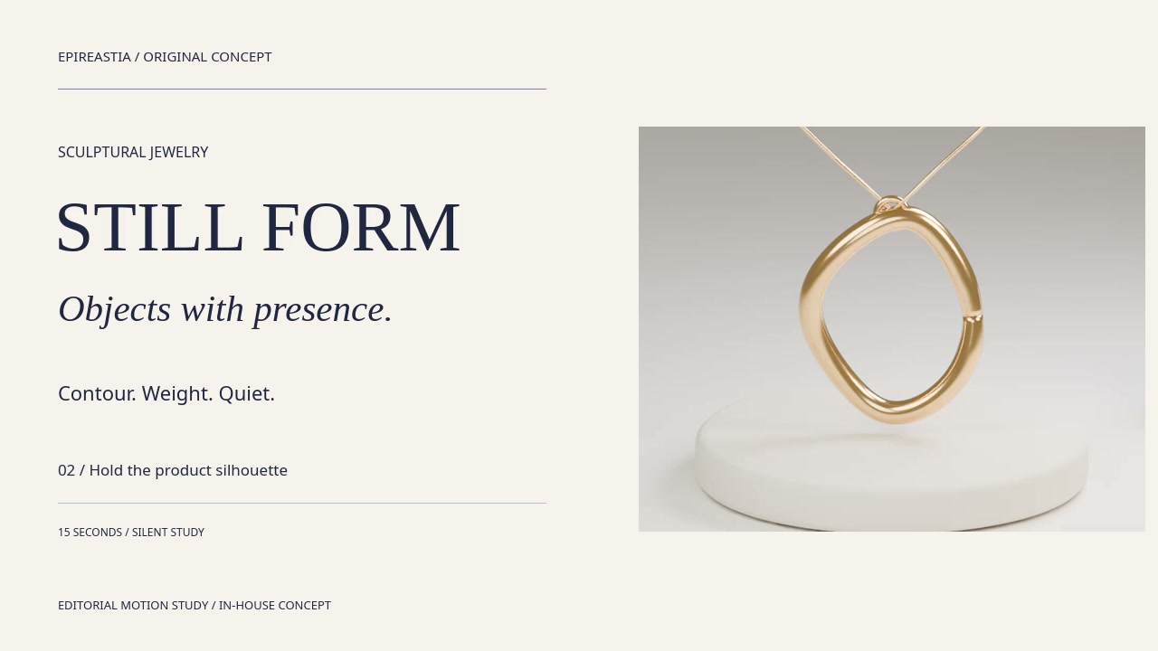
15 seconds / Editorial motion study
Quiet presence / a sculptural collection teaser built from form, reflection and pause.
Introduce the pendant first, connect it to the studs and cuff through matching light, then resolve to a clear collection lockup.
A playable edit of source stills, typography and camera-like reframing. The physical lighting, water, smoke or object actions described below are proposed film direction.
Considered curves, soft reflections and three objects with a shared visual rhythm.
Design demonstration. No retail offer, price or checkout.
A closer look
The object, in context.
The same source artwork carries from the campaign into this product presentation.
Explore the collection and inspect the image views.
Desktop A complete product view and a separate decision panel share the frame.
Mobile The image leads. Copy and the action move below it, preserving the subject.
Handoff Type, colour and image layers stay editable; the crop is evaluated inside the layout.
06 / Process & production
A clear source. A deliberate system.
The existing AI-rendered Orbit Pendant is the unchanged product reference for all three campaign placements. SVG composition supplies layout and typography, then ordinary resampling creates the export files. Arc Studs and Form Cuff are shown as separate collection objects, never substitutes for the pendant. No Photoshop or new product-generation step is claimed.
01 / Establish
A visual authority.
Begin with the original in-house AI-assisted product visual. Record the object, silhouette, material appearance and intended placement.
02 / Compose
A channel language.
Build each layout around the same image source. Keep typography and commerce copy separate in the live interface; inspect crops at their intended size.
03 / Review
A usable handoff.
Check object geometry, material, type hierarchy and responsive behaviour. Treat the motion edit as previsualisation for a future filmed or generated production.
Original in-house concept collection. No manufactured inventory, material-purity certification, retail offer, paid client commission or commercial results are claimed. Visual development and implementation were AI-assisted. No client approval, campaign performance or sales outcome is represented.
07 / Quality & system thinking
Keep what makes it itself.
Acceptance criteria for the concept system. Reusing a source protects visual continuity; it does not establish manufacturing feasibility or real-world performance.
01
Orbit Pendant retains the same open curve, connection point and chain in every placement
02
Studs and cuff remain separately named objects rather than changing pendant geometry
03
Gold-tone is an appearance description, not a claim of alloy or precious-metal purity
04
Complete product silhouettes and readable hierarchy remain visible on mobile
Included in this case study
16:9 campaign hero · 4:5 social creative · 1:1 pendant tile · Responsive collection concept · 15-second editorial motion study